One of the topics that has come up a few times during the development of Movit (my high-performance, high-quality video filter library) is the one of color and color spaces. There's a lot of information out there, but it took me quite a while to put everything together in my own head. Thus, allow me to share a distilled version; I'll try to skip all the detail and the boring parts. Color is an extremely complex topic, though; the more I understand, the more confusing it becomes. Thus, it will probably become quite long.
What is color?
Color is, ultimately, the way our vision reacts to the fact that light comes in many different frequencies. (In a sense, the field of color is actually more a subfield of biology than of physics.) In its most exact form, you can describe this with a frequency spectrum. For instance, here is (from Wikipedia) a typical spectrum of the sky on a clear summer day:

However, human eyes are not spectrometers; there are many colors with different frequency spectra that we perceive as the same. Thus, it's useful to invent some sort of representation that more closely corresponds to how we see color.
Now, almost everybody knows that we represent colors on computers with various amounts of red, green and blue. This is correct, but how do we go from those spectra to RGB values?
XYZ
The first piece of the puzzle comes in the form of the CIE 1931 XYZ color space. It defines three colors, X, Y and Z, that look like this (again Wikipedia; all the images in this post are):

Don't be confused that they are drawn in red, green and blue, because they don't correspond to RGB. (They also don't correspond to the different cones in the eye.)
In any case, almost all modern color theory starts off by saying that describing frequency spectra by various mixtures of X, Y and Z is a good enough starting point. (In particular, this means we discard infrared and ultraviolet.) As a handy bonus, Y corresponds very closely to our perception of overall brightness, so if you set X=Z=0, you can describe a black-and-white picture with only Y. (This is the same Y as you might have seen in YUV or YCbCr. Let me ignore the distinction between Y and Y' for now.)
Actually we tend to go one step further when discussing color, since we don't care about the brightness; we normalize the XYZ coordinates so that x+y+z=1, after which a color is uniquely defined with only its x and y (note that we now write lowercase!) values. (If we also include the original Y value, we have the full description of the same color again, so the xyY color space is equivalent to the XYZ one.)
RGB and spectral colors
So, now we have a way to describe colors in an absolute sense with only three numbers. Now, we already said earlier, usually we do this by using RGB. However, this begs the question: When I say “red”, which color do I mean exactly? What would be its xy coordinates?
The natural answer would probably be some sort of spectral color. We all know the spectral colors from the rainbow; they are the ones that contain a single wavelength of light. (Then we start saying stupid things like “white is not a color” since it is a mixture of many wavelengths, conveniently ignoring that e.g. brown is also a mixture and thus not in the rainbow. I've never heard anyone saying brown is not a color.) If you take all the spectral values, convert them to xy coordinates and draw them in a diagram, you get something like this:

(To be clear, what I'm talking about is the big curve, with markings from 380 nm to 700 nm.)
So now, we can define “red” to be e.g. light at 660 nm, and similar for green and blue. This gives rise to a gamut, the range of colors we can represent by mixing R, G and B in various amounts. For instance, here's the Rec. 2020 (Rec. = Recommendation) color space, used in the upcoming UHDTV standard:

You can see that we've limited ourselves a bit here; some colors (like spectral light at 500 nm) fall outside our gamut and cannot be represented except as some sort of approximation. Still, it's pretty good.
For a full description, we also need a white point that says where we end up when we set R=G=B, but let me skip over the discussion of “what is white” right now. (Hint: Usually it's not “equal amount of all wavelengths”.) There's also usually all sorts of descriptions about ambient lighting and flare in your monitor and whatnot—again, let me skip over them. You can see the white point marked off as “D65” in the diagram above.
A better compromise
You might have guessed by now that we rarely actually use spectral primaries today, and you're right. This has a few very important reasons:
First, it makes for a color space that is very hard to realize in practice. How many things to do you know that can make exactly single-frequency light? Probably only one: Lasers. I'm sure that having a TV built with a ton of lasers would be cool (*pew pew*!), but right now, we're stuck with LCD and LED and such. (You may have noticed that outside a certain point, all the colors in the diagram look the same. Your monitor simply can't show the difference anymore.) You could, of course, argue that we should let it be the monitor's problem to figure out what do to with the colors it can't represent, but proper gamut mapping is very hard, and the subject of much research.
Second, the fact that the primaries are far from each other means that we need many bits to describe transitions between them smoothly. The typical 8 bits of today are not really enough; UHDTV will be done with 10- or 12-bit precision. (Processing should probably have even more; Movit uses full floating-point.)
Third, pure colors are actually quite dim (they contain little energy). When producing a TV, color reproduction is not all you care about; you also care about light level for e.g. white. If we reduce the saturation of our primaries a bit (moving them towards the white point), we make it easier to get a nice and bright output image.
So, here are the primaries of the sRGB color space, which is pretty much universally used on PCs today (and the same primaries as Rec. 709, used for today's HDTV broadcasts):
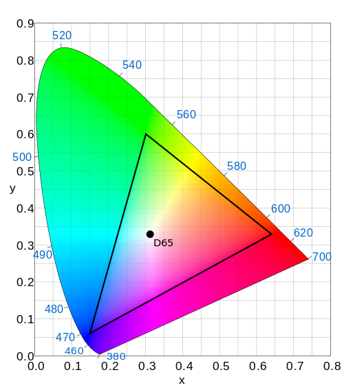
Quite a bit narrower; in particular, we've lost a lot in the greens. This is why some photographers prefer to work in a wider color space like e.g. Adobe RGB; no need to let your monitor's limitations come between what your camera and printer can do. (Printer gamuts are a whole new story, and they don't really work the same way monitor gamuts do.)
Color spaces and Movit
So, this is why Movit, and really anything processing color data, has to care: To do accurate color processing, you must know what color space you are working in. If you take in RGB pixels from an sRGB device, and then take those exact values and show on an SDTV (which uses a subtly different color space, Rec. 601), your colors will be slightly off. Remember, red is not red. sRGB and SDTV are not so different, but what about sRGB and Rec. 2020? If you take your sRGB data and try to send it on the air for UHDTV, it will look strangely oversaturated.
You could argue that almost everything is sRGB right now anyway, and that the difference between sRGB and Rec. 601 is so small that you can ignore it. Maybe; I prefer not to give people too many reasons to hate my software in the future. :-)
So Movit solves this by moving everything into the same colorspace on input, and processes everything as sRGB internally. (Basically what you do is you convert the color from whatever colorspace to XYZ, and then from XYZ to sRGB. On output, you go the other way.) Lightroom does something similar, only with a huge-gamut colorspace (so big it includes “imaginary colors”, colors that can't actually be represented as spectra) called Pro Photo RGB; I might go that way in the future, but currently, sRGB will do.